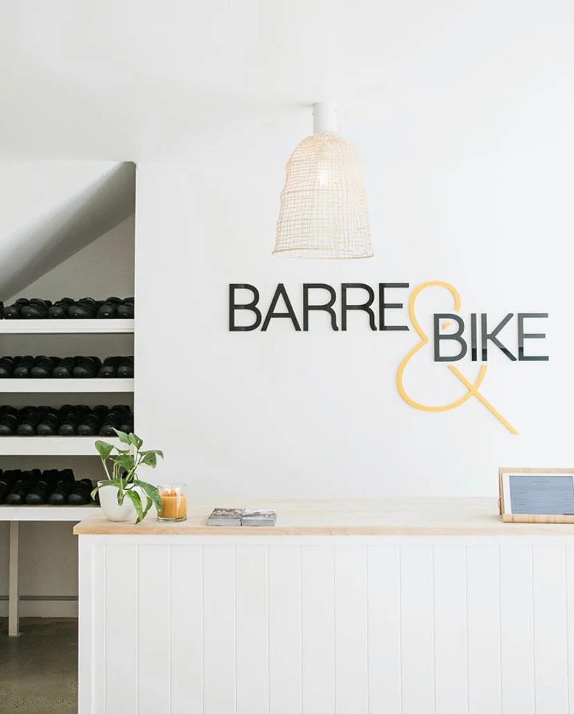
Barre & Bike
The owner of Barre & Bike approached me earlier in 2019 to kick start her new brand. She had a big dream and strong vision, but needed help bringing it to life. We worked together to create her modern and iconic brand for Barre & Bike that stood out amongst the crowd.
“We went to Chelsea with very little idea of what we wanted for our new business’s brand. As a new boutique fitness studio we knew strong branding would play a very important role in our business’s success. Knowing Chelsea and the work she’s done in the past, we were happy to leave it all in her hands and are so grateful for the beautiful logo she created for us. The brand is clean & minimal; it has a high-end feel which was important for us to portray, and it’s forever a talking point among our clients who love how we’ve been able to brand the studio and equipment throughout. Can’t thank Chelsea enough and highly recommend her services!”
- Elisha Dyck, Owner, Barre & Bike
The Edward Brown Collective
Edward Brown Collective are the ultimate in high end hair specialists on Sunshine Coast. In 2021, the salon moved their space beachfront and needed a new brand to match their minimalist coastal vibe. A clean, crisp and upmarket salon full of raw and neutral tones was the inspiration for this new brand.
Two Palms Collective
Two Palms Collective approached me with their strong vision for a holistic, soft, and feminine new logo to showcase their upcoming range of stunning crystal & essential oil infused Candles & Bath soaks. The brief required two logo versions, one for every day use with more detail, and a simplified version to use for candle stickers.
These girls are passionate about giving women beautiful rituals of self love to enjoy at home and they wanted this portrayed in their branding. Their candles and soaks are lovingly handmade Sunshine Coast.
AllSpark Energy
AllSpark Energy were looking for a new brand that would stand out amongst a sea of competitors in the same industry on the Sunshine Coast.
The result was a brand with eye catching typesetting and bold teal highlights set against monochromatic imagery. From here, stationery and car signage was created and the brand was rolled out across social media accounts.
Turn Engineering
Turn Engineering is a new civil engineering consultancy on the Sunshine Coast. The owner, Mitch, wanted a brand that would stand out amongst a crowd of very corporate looking competitors.
His brief was to bring an organic and coastal feel to make his brand pop and have a point of difference.
Alan Holliday Town Planning Pty Ltd
Alan Holliday Consulting Town Planners required a rebrand which was strong, clean & professional to stand out amongst competitors and be memorable for clients. Alan has a very reliable and highly recommended reputation on the Sunshine Coast and his brand image needed to visually uphold this image as well as showing his open and friendly nature. A new visual identity was created using strong and soft blues and greys with clean and easy to read typesetting.
Since the creation of the new branding, we have rolled out a new website, stationery and signage for Alan.
Accurate Air Conditioning & Refrigeration
Accurate Air Conditioning & Refrigeration needed a bold and stand out brand as a start up business.
The logo and colours needed to be instantly recognisable and easily read on car signage as this was the businesses main point of advertising between the Sunshine Coast to Brisbane.
Live for Leisure
Live for Leisure is a lifestyle brand dedicated to living outdoors. The brand needed various sub brands to capture an audience who enjoy fishing, camping and four wheel driving. All branding is intended to be used across various merchandise such as clothing, bags, stubby coolers etc.
Profile Magazine
In 2015 I joined the team running the largest lifestyle publication on the Sunshine Coast, Profile Magazine. I began at Profile as a Senior Designer, before becoming Art Director in 2016 until leaving to have our baby girl in 2018.
From designing the magazine, to internal and external marketing, managing the Profile design team to working with stakeholders and all management levels, planning covershoots and styling to managing intensive proofing schedules. Every 80-100 page issue was meticulously proofed by myself with an eagle eye for detail right up until print deadline.
Profile was fast paced, high pressure, always evolving, and an amazing team.
Mako Building Group
Mako Building Group are a small family run builder on the Sunshine Coast. The business name was inspired from the Mako shark and the logo needed to include aspects of this in the design. This resulted in deep ocean blues against lighter aqua colours and incorporated the shark fin into the word.
Rowland Financial Advisory
Rowland Financial Advisory was launched from the closure of Whittaker Macnaught. The brand was designed to feel coastal and local being based in Cotton Tree. The creative concept throughout all materials such as corporate brochure, website design, press ads, flyers, signage and a 15 second TVC. After launching the new brand, Michael won a national award for ‘best new brand’ with Financial Wisdom.
*This design work was conducted at Six Elements
Adaptive Bodies Allied Health
Adaptive Bodies and Allied Health and sister company, Adaptive Women, are Sunshine Coast based business dedicated to improving their clients health. They needed a new brand that was clean and visually strong being new businesses. Adaptive Women required a softer, more feminine look.


